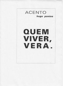
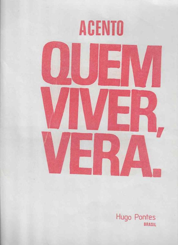
Impressão gráfica de Hugo Pontes intitulada Acento Quem Viver Verá, obra de poesia visual e experimentação tipográfica construída a partir da expressão popular Quem viver verá.
Hugo Pontes
Categoria: Mail Art
Acervo: 04092
Dimensões: 31,5 x 21,5 cm
TEXTO SALSA EM PORTUGUÊSImpressão gráfica de Hugo Pontes intitulada Acento Quem Viver Verá, obra de poesia visual e experimentação tipográfica construída a partir da expressão popular Quem viver verá. A composição utiliza letras vermelhas de grande escala sobre fundo branco e organiza a frase em três blocos principais. Na parte superior aparece a palavra ACENTO. Abaixo, a expressão QUEM VIVER, VERÁ ocupa quase todo o campo visual, com forte contraste, monumentalidade tipográfica e uso deliberado da pontuação.O trabalho transforma uma frase cotidiana em estrutura poética visual. A palavra ACENTO orienta a leitura para a importância gráfica e semântica do acento presente em VERÁ. O poema evidencia como um pequeno sinal diacrítico pode alterar a pronúncia, o tempo verbal e o sentido de uma palavra. Dessa forma, linguagem, ortografia e tipografia tornam se elementos centrais da composição.A distribuição das palavras explora escala, pausa, ritmo e hierarquia visual. QUEM aparece em grande dimensão na primeira linha, VIVER ocupa a segunda e VERÁ conclui a sequência na terceira. A vírgula após VIVER e o ponto final após VERÁ reforçam a construção sintática e visual da frase. No canto inferior direito aparecem as inscrições Hugo Pontes e BRASIL, identificando autoria e procedência nacional.Acento Quem Viver Verá integra a produção de Hugo Pontes relacionada à poesia visual brasileira, poesia experimental, poesia concreta, tipografia, semiótica, comunicação visual, linguagem verbal, signos gráficos, ortografia e relações entre palavra, som e imagem.SALSA TEXT IN ENGLISHGraphic print by Hugo Pontes titled Acento Quem Viver Verá, a work of visual poetry and typographic experimentation constructed from the popular Portuguese expression Quem viver verá. The composition uses large red letters against a white background and organizes the phrase into three main blocks. At the top appears the word ACENTO. Below it, the expression QUEM VIVER, VERÁ occupies most of the visual field, creating strong contrast, typographic monumentality and a deliberate use of punctuation.The work transforms an everyday phrase into a visual poetic structure. The word ACENTO directs attention to the graphic and semantic importance of the accent mark in VERÁ. The poem emphasizes how a small diacritical sign can alter pronunciation, verb tense and meaning. Language, orthography and typography therefore become central components of the composition.The arrangement of the words explores scale, pause, rhythm and visual hierarchy. QUEM appears in large scale on the first line, VIVER occupies the second and VERÁ concludes the sequence on the third. The comma after VIVER and the final period after VERÁ reinforce both the syntactic and visual construction of the phrase. At the lower right appear the inscriptions Hugo Pontes and BRASIL, identifying authorship and national origin.Acento Quem Viver Verá belongs to Hugo Pontes production associated with Brazilian visual poetry, experimental poetry, concrete poetry, typography, semiotics, visual communication, verbal language, graphic signs, orthography and relationships between word, sound and image.
TEXTO DE OBSERVAÇÃO EM PORTUGUÊSDocumento gráfico de Hugo Pontes impresso predominantemente em vermelho sobre fundo branco. A obra apresenta no alto a palavra ACENTO em letras maiúsculas. No centro da página aparece a expressão QUEM VIVER, VERÁ distribuída em três linhas de grande impacto visual. Na parte inferior direita constam Hugo Pontes e BRASIL.A obra é estruturada a partir da relação entre linguagem verbal e sinal gráfico. O termo Acento funciona como chave de leitura para a palavra VERÁ, cuja acentuação gráfica diferencia o futuro do verbo ver de outras possibilidades de leitura. O acento deixa portanto de ser apenas uma convenção ortográfica e passa a constituir o assunto do poema e um elemento de construção visual.A frase Quem viver verá possui caráter proverbial e expressa a ideia de que somente o futuro poderá confirmar determinado acontecimento. Hugo Pontes desloca essa expressão popular para o campo da poesia visual e destaca sua estrutura linguística. O significado temporal da frase torna se especialmente importante porque a palavra verá é um verbo projetado para o futuro. A própria obra estabelece assim uma relação entre linguagem, tempo, expectativa e experiência.A pontuação também participa da composição. A vírgula após VIVER cria uma pausa visual e sintática entre condição e consequência. O ponto final após VERÁ encerra a formulação de maneira gráfica e categórica. Letras, acento, vírgula e ponto são tratados como componentes plásticos e semânticos do poema.O uso exclusivo do vermelho para os elementos textuais produz forte contraste com o fundo branco. A escala monumental das palavras QUEM, VIVER e VERÁ aproxima a peça da linguagem do cartaz, da publicidade e da comunicação de massa, ao mesmo tempo em que mantém uma economia formal típica de experiências de poesia visual.A obra demonstra o interesse de Hugo Pontes pelos mecanismos internos da língua portuguesa, especialmente pela capacidade de sinais mínimos produzirem alterações de sentido. O poema pode ser estudado dentro de pesquisas sobre poesia visual, poesia concreta, poema semiótico, tipografia experimental, ortografia como linguagem artística, signos diacríticos, comunicação gráfica e relações entre oralidade e escrita.A inscrição Hugo Pontes BRASIL permite a identificação direta do autor e da procedência nacional da peça. Não há data visível na imagem apresentada, portanto a obra deve permanecer catalogada como sem data ou data não identificada até que documentação complementar permita estabelecer uma cronologia segura.Para indexação digital são especialmente relevantes os termos Hugo Pontes, Acento, Quem Viver Verá, Quem Viver Vera, poesia visual, visual poetry, poesia experimental, poesia concreta, concrete poetry, poema visual, tipografia experimental, acento gráfico, diacrítico, ortografia, língua portuguesa, semiótica, comunicação visual, arte gráfica, palavra e imagem, linguagem e tempo, Brasil e poesia visual brasileira.OBSERVATION TEXT IN ENGLISHGraphic document by Hugo Pontes printed predominantly in red against a white background. At the top appears the word ACENTO in uppercase letters. In the center of the page the expression QUEM VIVER, VERÁ is distributed across three lines with strong visual impact. At the lower right appear Hugo Pontes and BRASIL.The work is structured around the relationship between verbal language and graphic signs. The term Acento functions as a key to reading the word VERÁ, whose written accent distinguishes the future tense of the Portuguese verb ver from other possible readings. The accent therefore ceases to be merely an orthographic convention and becomes both the subject of the poem and an element of visual construction.The expression Quem viver verá is a common Portuguese saying conveying the idea that only the future will confirm what will happen. Hugo Pontes displaces this everyday expression into the field of visual poetry and emphasizes its linguistic structure. The temporal meaning of the phrase becomes particularly important because verá is a verb projected into the future. The work therefore establishes a relationship between language, time, expectation and experience.Punctuation also participates in the composition. The comma after VIVER creates both a visual and syntactic pause between condition and consequence. The period after VERÁ closes the statement in a graphic and categorical manner. Letters, accent mark, comma and period are all treated as plastic and semantic components of the poem.The exclusive use of red for the textual elements creates a strong contrast with the white background. The monumental scale of the words QUEM, VIVER and VERÁ brings the piece close to the visual language of posters, advertising and mass communication while preserving the formal economy characteristic of visual poetry experiments.The work demonstrates Hugo Pontes interest in the internal mechanisms of the Portuguese language, especially the ability of minimal signs to produce changes in meaning. The poem is relevant to research on visual poetry, concrete poetry, semiotic poetry, experimental typography, orthography as artistic language, diacritical signs, graphic communication and relationships between speech and writing.The inscription Hugo Pontes BRASIL directly identifies the author and national origin of the piece. No date is visible in the image provided, therefore the work should remain catalogued as undated or date unidentified until complementary documentation allows a reliable chronology to be established.For digital indexing, particularly relevant terms include Hugo Pontes, Acento, Quem Viver Verá, Quem Viver Vera, visual poetry, experimental poetry, concrete poetry, visual poem, experimental typography, accent mark, diacritic, orthography, Portuguese language, semiotics, visual communication, graphic art, word and image, language and time, Brazil and Brazilian visual poetry.
Proveniência
Coleção Poema ProcessoInglês
Graphic print by Hugo Pontes titled Acento Quem Viver Verá, a work of visual poetry and typographic experimentation constructed from the popular Portuguese expression Quem viver verá.
Dimensions: 12,4 x 8,5 in