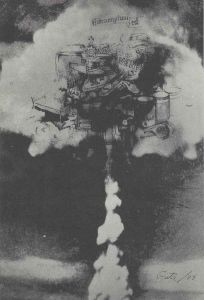
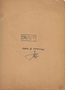
Publicidade é uma obra de Artur Matuck realizada em 1974 como contribuição para On Off 3, terceira edição da publicação de artista organizada por Julio Plaza e Regina Silveira.
Projeto On / Off - Julio Plaza e Regina Silveira
Categoria: Mail Art
Acervo: 03683
Data: 1974
Dimensões: 23 x 15,8 cm
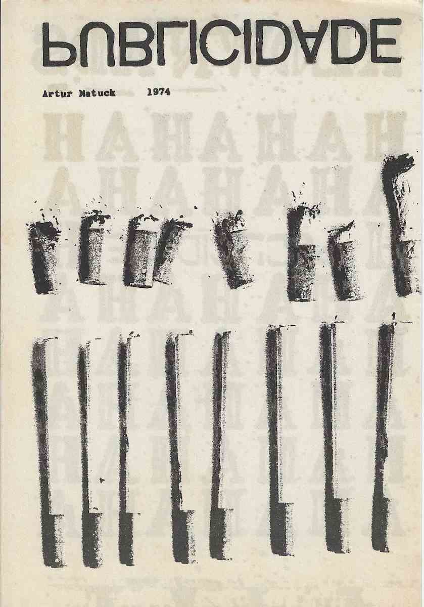
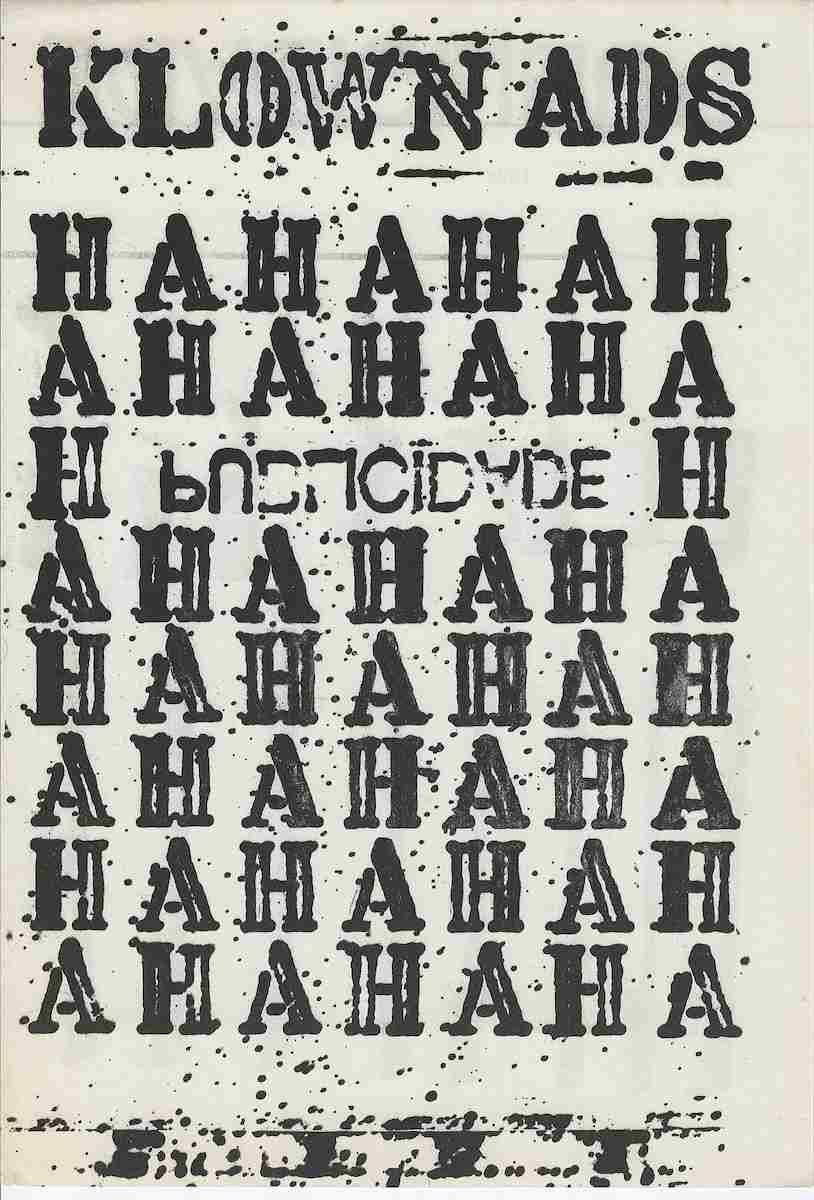
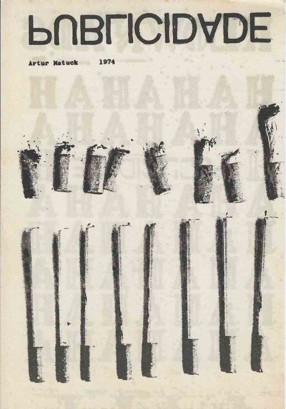
Publicidade é uma obra de Artur Matuck realizada em 1974 como contribuição para On Off 3, terceira edição da publicação de artista organizada por Julio Plaza e Regina Silveira. O Museu de Arte Contemporânea da Universidade de São Paulo confirma o título Publicidade, a autoria de Artur Matuck, a data de 1974 e a vinculação da obra ao conjunto de On Off 3. O exemplar preservado pelo museu possui o número de inventário 1989.24.85.10.A composição apresenta, na região superior, a palavra PUBLICIDADE construída em grandes caracteres negros de desenho geométrico. As letras foram submetidas a inversões e alterações de orientação que dificultam a leitura imediata. Algumas formas parecem rotacionadas ou espelhadas, transformando a palavra em imagem e fazendo com que o título funcione simultaneamente como informação verbal, logotipo e estrutura visual.Logo abaixo aparecem a identificação Artur Matuck e a data 1974 em caracteres menores. Essa inscrição estabelece autoria e cronologia, ao mesmo tempo em que contrasta com a escala monumental e com a instabilidade gráfica da palavra situada acima.A parte central e inferior da folha é ocupada por duas sequências de formas verticais reproduzidas em preto e cinza. Na sequência superior aparecem objetos mais curtos, com extremidades irregulares e pequenas manchas ao redor. Na sequência inferior aparecem formas alongadas e repetidas, algumas com bases mais densas e pequenas extensões laterais.Os objetos podem lembrar tubos, recipientes, embalagens, instrumentos, fósforos, pincéis, frascos, produtos industriais ou silhuetas de mercadorias. A fotografia não permite estabelecer com segurança sua natureza original. Essa indeterminação é significativa porque aproxima a imagem da lógica publicitária, na qual a forma de um produto pode ser repetida, ampliada e transformada em sinal antes mesmo de sua função ser integralmente compreendida.As duas séries criam uma organização próxima de um mostruário, inventário comercial, catálogo ou exposição de mercadorias. Os elementos aparecem alinhados e distribuídos em intervalos relativamente regulares, mas não são idênticos. Cada forma possui alterações de largura, textura, densidade e contorno. A repetição aproxima os objetos de uma produção em série, enquanto as diferenças preservam sinais de imperfeição, desgaste ou intervenção manual.A obra utiliza a palavra publicidade para nomear e, ao mesmo tempo, questionar o próprio sistema visual da propaganda. Em vez de apresentar uma mensagem comercial clara, um produto plenamente reconhecível ou uma marca destinada ao consumo, Artur Matuck oferece uma imagem de leitura instável. A palavra pode ser identificada, mas sua orientação foi alterada. Os produtos parecem organizados para exposição, mas não são facilmente nomeados.Essa tensão modifica a função habitual da publicidade. A propaganda procura tornar a mensagem rápida, sedutora e imediatamente compreensível. Nesta obra, o processo é invertido. O observador precisa reconstruir a palavra, examinar as formas e tentar compreender o que está sendo apresentado. A comunicação deixa de ser transparente e transforma se em problema visual.A inversão gráfica da palavra pode ser relacionada aos processos de transformação da linguagem que se tornariam recorrentes na produção de Artur Matuck. Sua trajetória posterior inclui investigações sobre escrita experimental, criação de palavras, comunicação, meios eletrônicos, arte participativa, telemática e sistemas de produção textual. O próprio artista descreve sua atuação como artista de mídia, escritor, pesquisador e educador ligado às relações entre arte, comunicação, literatura, tecnologia e linguagem.Em Publicidade, essa investigação já aparece por meio da alteração da palavra impressa. O termo permanece reconhecível, mas suas letras deixam de obedecer completamente à orientação convencional. A linguagem verbal é tratada como matéria plástica, sujeita a rotação, espelhamento, deslocamento e recomposição.A palavra ocupa posição semelhante à de um cabeçalho publicitário ou nome de marca. Contudo, em vez de organizar a mensagem, ela cria ruído e ambiguidade. A obra apropria se da aparência da comunicação comercial para interromper seus mecanismos de leitura.A presença das formas repetidas reforça a relação com consumo e produção industrial. A publicidade depende da multiplicação de imagens, da repetição de marcas e da circulação constante de mensagens. A obra incorpora visualmente essa lógica por meio das séries de objetos, mas retira as informações que permitiriam identificar fabricante, preço, finalidade ou vantagem comercial.Os objetos tornam se signos sem legenda. Eles preservam a aparência geral de produtos, mas não oferecem uma identidade comercial definida. A obra pode, assim, ser compreendida como reflexão sobre a capacidade da publicidade de transformar qualquer forma em mercadoria e qualquer repetição em promessa de valor.Ao fundo da composição parecem existir letras ou palavras muito claras, parcialmente apagadas pela sobreposição dos elementos principais. Esses vestígios ampliam a impressão de uma superfície formada por mensagens sucessivas, impressões incompletas e camadas de comunicação. A leitura integral desse texto de fundo não pode ser confirmada pela imagem apresentada e não deve ser transcrita de forma definitiva sem exame direto da folha.As manchas e irregularidades ao redor dos objetos também são importantes. Elas impedem que as formas adquiram a limpeza característica de um anúncio comercial convencional. Em lugar de superfícies perfeitas, surgem marcas, falhas, vazamentos, desgaste e diferenças de impressão. O sistema publicitário é apresentado por meio de uma materialidade instável.A sequência inferior possui maior alongamento vertical e aproxima os objetos de sinais gráficos. Eles podem ser observados como barras, colunas, letras incompletas ou unidades de um código. A repetição transforma produtos possíveis em elementos de uma escrita visual cuja mensagem permanece aberta.A composição relaciona palavra e objeto sem estabelecer uma correspondência direta entre eles. O título identifica o campo geral da publicidade, mas não explica individualmente as formas. O observador precisa produzir relações entre linguagem, repetição, mercadoria, técnica e imagem.Publicidade integra um momento inicial da produção de Artur Matuck. O acervo do MAC USP registra outras obras do artista realizadas em 1974, entre elas Imago, Anima, Protocultura, Alegoria, aAaAaAa, Aion Hekatombe, In Sonoris Causa, Monada Aion e Reflekso Hekatombe. Esse conjunto demonstra o interesse do artista por linguagem, imagem, sistemas simbólicos e construção de novos termos durante o mesmo período.Como parte de On Off 3, Publicidade integrava uma publicação coletiva formada por trabalhos independentes reunidos em envelope. O MAC USP registra no mesmo conjunto contribuições de Gerson Zanini, Roberto Keppler, Gabriel Borba, Guta e Fábio Moreira Leite, Ubirajara Ribeiro, Mário Ishikawa, Amélia Toledo, Julio Plaza, Artur Matuck, Donato Chiarella e Regina Silveira, Antônio Celso Sparapan e Anésia Pacheco e Chaves, Donato Ferrari e Míriam Chiaverini.On Off foi editada por Julio Plaza e Regina Silveira entre 1972 e 1974. A publicação reuniu artistas ligados à arte conceitual, à experimentação gráfica, à fotografia, à poesia visual, à publicação de artista e às formas alternativas de circulação.A condição editorial é essencial para a compreensão da obra. A folha podia ser retirada do envelope, observada separadamente, comparada às demais contribuições e novamente integrada ao conjunto. O trabalho existia como obra autônoma e como parte de uma estrutura coletiva de comunicação.A circulação por meio de uma publicação independente aproximava Publicidade dos próprios mecanismos que ela parece examinar. Assim como uma mensagem publicitária, a imagem podia ser reproduzida, distribuída e recebida por diferentes pessoas. Entretanto, em vez de vender um produto, a obra colocava em questão a legibilidade, a repetição e a construção visual utilizadas pela propaganda.O suporte editorial também transforma o observador em leitor. A obra não depende somente da contemplação formal. Ela exige reconhecimento da palavra, comparação entre as figuras, interpretação das inversões e percepção das falhas da imagem. Ver e ler tornam se atividades inseparáveis.Publicidade constitui um documento relevante da arte conceitual, da poesia visual e da experimentação editorial brasileira da década de 1970. A obra articula palavra, inversão, repetição, mercadoria, impressão, falha, comunicação e circulação. Sua presença em On Off 3 insere a investigação de Artur Matuck numa plataforma coletiva em que linguagem e reprodução funcionavam como elementos centrais da prática artística.Text for the Salsa program in EnglishPublicidade is a work created by Artur Matuck in 1974 as a contribution to On Off 3, the third issue of the artists publication organized by Julio Plaza and Regina Silveira. The Museum of Contemporary Art of the University of São Paulo confirms the title Publicidade, the authorship of Artur Matuck, the date 1974 and the association of the work with On Off 3. The example preserved by the museum bears accession number 1989.24.85.10.The upper area contains the word PUBLICIDADE constructed through large black geometric characters. Several letters have been inverted or altered in orientation, preventing immediate conventional reading. The word becomes image and functions simultaneously as verbal information, logo and visual structure.The identification Artur Matuck and the date 1974 appear below in smaller characters. This inscription establishes authorship and chronology while contrasting with the large scale and graphic instability of the word above.The central and lower regions contain two sequences of vertical forms reproduced in black and grey. The upper sequence consists of shorter objects with irregular ends and small marks around their surfaces. The lower sequence contains elongated and repeated forms, some with denser bases and small lateral extensions.The objects may resemble tubes, containers, packages, instruments, matches, brushes, bottles, industrial products or silhouettes of commodities. Their exact nature cannot be securely established from the photograph. This uncertainty is significant because it connects the image with advertising systems in which the form of a product may be repeated, enlarged and transformed into a sign before its function is fully understood.The two series create an arrangement related to a commercial display, product inventory, catalogue or exhibition of goods. The elements are aligned at relatively regular intervals but are not identical. Each form contains variations of width, texture, density and contour. Repetition suggests serial production, while the differences preserve evidence of imperfection, wear or manual intervention.The work uses the word Publicidade to identify and simultaneously question the visual system of advertising. Rather than presenting a clear commercial message, a recognizable product or a brand intended for consumption, Artur Matuck offers an unstable image. The word can be recognized, yet its letters have been transformed. The products appear organized for display, yet they cannot be easily named.This tension reverses the usual function of advertising. Commercial communication seeks to make its message rapid, attractive and immediately understandable. In this work, the viewer must reconstruct the word, examine the repeated forms and attempt to understand what is being presented. Communication becomes a visual problem.The graphic inversion of the word may be related to the processes of linguistic transformation that became recurrent in Artur Matuck
s later practice. His work has included experimental writing, the creation of new words, communication systems, electronic media, participatory art and telematic projects. The artist describes his professional activity through the fields of media art, writing, research, education, communication and technology.In Publicidade, this investigation is already visible through the transformation of printed language. The word remains recognizable but no longer follows conventional orientation. Verbal language is treated as visual matter subject to rotation, reflection, displacement and recomposition.The word occupies a position similar to an advertising headline or commercial brand. Instead of organizing the message, however, it creates noise and ambiguity. The work appropriates the appearance of commercial communication while interrupting its normal reading mechanisms.The repeated forms reinforce the relationship with consumption and industrial production. Advertising depends on image multiplication, brand repetition and the constant circulation of messages. The work incorporates this logic through its series of objects while removing information concerning manufacturer, price, purpose or commercial advantage.The objects become signs without captions. They retain the appearance of products but do not offer a defined commercial identity. The work may therefore be understood as a reflection on the capacity of advertising to transform any form into a commodity and any repetition into a promise of value.Very faint letters or words seem to exist behind the principal elements. These traces create the impression of a surface formed through successive messages, incomplete impressions and layers of communication. The complete background text cannot be securely read from the image and should not be definitively transcribed without direct examination.Marks and irregularities around the objects prevent the forms from acquiring the polished appearance of conventional commercial advertising. Instead of perfect surfaces, the viewer encounters stains, failures, leaks, wear and variations of print. The advertising system is presented through unstable materiality.The lower sequence is more elongated and transforms the objects into graphic signs. They may be perceived as bars, columns, incomplete letters or units within an unknown code. Repetition converts possible products into elements of visual writing whose message remains open.The composition connects word and object without establishing a direct correspondence between them. The title identifies the general field of advertising but does not explain the individual forms. The viewer must construct relationships among language, repetition, commodities, technique and image.Publicidade belongs to an early period in Artur Matuck
s production. MAC USP records several other works by the artist made in 1974, including Imago, Anima, Protocultura, Alegoria, aAaAaAa, Aion Hekatombe, In Sonoris Causa, Monada Aion and Reflekso Hekatombe. This group demonstrates his interest in language, imagery, symbolic systems and the construction of new terms during the same period.As part of On Off 3, Publicidade belonged to a collective publication composed of independent contributions assembled inside an envelope. MAC USP records within the same group works by Gerson Zanini, Roberto Keppler, Gabriel Borba, Guta and Fábio Moreira Leite, Ubirajara Ribeiro, Mário Ishikawa, Amélia Toledo, Julio Plaza, Artur Matuck, Donato Chiarella and Regina Silveira, Antônio Celso Sparapan and Anésia Pacheco e Chaves, Donato Ferrari and Míriam Chiaverini.On Off was edited by Julio Plaza and Regina Silveira between 1972 and 1974. The publication brought together artists connected with conceptual art, graphic experimentation, photography, visual poetry, artists publishing and alternative circulation.The editorial condition is essential to understanding the work. The sheet could be removed from the envelope, viewed independently, compared with the other contributions and returned to the set. It existed simultaneously as an autonomous work and as part of a collective communication structure.Circulation through an independent publication connected Publicidade with the mechanisms it appears to examine. Like an advertising message, the image could be reproduced, distributed and received by different people. Rather than selling a product, however, it questioned legibility, repetition and the visual construction used by advertising.The publication also transforms the viewer into a reader. The work requires recognition of the word, comparison among repeated figures, interpretation of inversion and attention to printing failures. Seeing and reading become inseparable activities.Publicidade is a significant document of Brazilian conceptual art, visual poetry and experimental publishing during the 1970s. It brings together language, inversion, repetition, commodities, printing, failure, communication and circulation. Its inclusion in On Off 3 places Artur Matuck
s investigation within a collective platform in which language and reproduction operated as central elements of artistic practice.
Obra impressa sobre papel em orientação vertical.Na parte superior aparece a palavra PUBLICIDADE em grandes caracteres negros. As letras apresentam alterações de orientação, rotação ou espelhamento, dificultando a leitura convencional e transformando a palavra em elemento visual.Logo abaixo encontram se a identificação Artur Matuck e a data 1974.A região central contém uma sequência de formas verticais curtas, reproduzidas em preto e cinza, com contornos irregulares e pequenas manchas. Na parte inferior aparece outra sequência formada por objetos mais alongados, alinhados verticalmente e separados por intervalos.A natureza dos objetos não pode ser confirmada somente pela fotografia. Eles podem lembrar produtos, tubos, recipientes, instrumentos, embalagens ou elementos gráficos. O cadastro não deve estabelecer uma identificação material definitiva sem documentação complementar.Ao fundo aparecem inscrições muito claras e parcialmente apagadas. A leitura integral não é segura e deve ser registrada como texto impresso parcialmente ilegível.O MAC USP identifica formalmente a obra como Publicidade, de Artur Matuck, datada de 1974 e integrante de On Off 3. O exemplar institucional possui o número de inventário 1989.24.85.10.A ficha pública localizada confirma título, autoria, data e vinculação à publicação, mas não forneceu de forma individualizada a técnica e as dimensões desta peça. Como outras contribuições de On Off 3 preservadas pelo MAC USP possuem dimensões próximas de 23 por 15,5 centímetros ou 23 por 16 centímetros e foram produzidas em offset sobre papel, esses dados podem servir apenas como referência comparativa e não devem ser aplicados definitivamente sem medição ou ficha específica da obra.A técnica pode ser cadastrada provisoriamente como impressão gráfica em preto e cinza sobre papel.A fotografia mostra tonalidade amarelada, pequenas manchas, alterações superficiais, falhas de impressão, discretas ondulações e possíveis sinais de manuseio. Parte dessas irregularidades pode integrar o processo gráfico original. A diferenciação entre característica técnica e dano de conservação exige exame presencial.Não foram confirmados para este exemplar específico a tiragem, a numeração, a assinatura manuscrita, o local de impressão, a posição original dentro do envelope ou sua proveniência anterior.O número de inventário 1989.24.85.10 pertence exclusivamente ao exemplar do MAC USP e não deve ser atribuído à folha apresentada sem documentação que confirme tratar se do mesmo objeto.Observation text in EnglishVertically oriented printed work on paper.The word PUBLICIDADE appears in large black characters at the top. The letters contain changes of orientation, rotation or reflection that complicate conventional reading and transform the word into a visual element.The identification Artur Matuck and the date 1974 appear immediately below.The central region contains a sequence of short vertical forms reproduced in black and grey, with irregular contours and small surrounding marks. The lower section presents another sequence of longer objects aligned vertically and separated by intervals.The nature of the objects cannot be confirmed from the photograph alone. They may resemble products, tubes, containers, instruments, packages or graphic elements. The catalogue should not establish a definitive material identification without additional documentation.Very faint inscriptions appear in the background. Their complete wording is not sufficiently legible and should be recorded as partially illegible printed text.MAC USP formally identifies the work as Publicidade by Artur Matuck, dated 1974 and associated with On Off 3. The institutional example bears accession number 1989.24.85.10.The public record located confirms title, authorship, date and association with the publication but did not provide an individualized technique and dimensions for this piece. Other On Off 3 contributions preserved by MAC USP measure approximately 23 by 15.5 centimetres or 23 by 16 centimetres and were produced in offset on paper. These figures should be used only as comparative references and not assigned definitively without direct measurement or a specific institutional record.The technique may provisionally be described as black and grey graphic printing on paper.The image displays yellowing, minor stains, surface changes, printing irregularities, discreet undulations and possible handling traces. Some irregularities may belong to the original graphic process. Distinguishing technical characteristics from conservation damage requires direct examination.The print run, numbering, handwritten signature, printing location, original position within the envelope and earlier provenance of this specific example have not been confirmed.Accession number 1989.24.85.10 belongs exclusively to the MAC USP example and should not be assigned to the sheet shown without documentation confirming that it is the same object.
Proveniência
Coleção Poema ProcessoInglês
Publicidade is a work created by Artur Matuck in 1974 as a contribution to On Off 3, the third issue of the artists publication organized by Julio Plaza and Regina Silveira.
Dimensions: 9,1 x 6,2 in