Poesia visual original de Pete Spence, poeta, artista postal e editor australiano ligado à poesia visual, poesia concreta, poesia experimental e às redes internacionais de mail art.
Pete Spence - Peter Spence - Australia
Categoria: Poesia Visual
Acervo: 03774
Dimensões: 29,7 x 21 cm
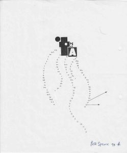
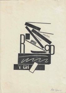
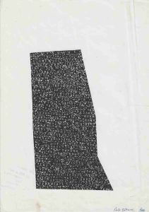
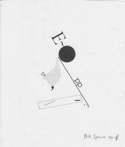
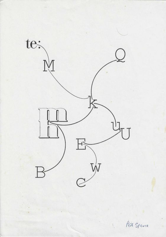
Poesia visual original de Pete Spence, poeta, artista postal e editor australiano ligado à poesia visual, poesia concreta, poesia experimental e às redes internacionais de mail art. A obra apresenta uma composição tipográfica de caráter diagramático, formada por letras isoladas, fragmentos de palavras, diferentes corpos tipográficos e linhas curvas que conectam os elementos como se fossem trajetórias, fluxos ou relações dentro de um sistema.A composição ocupa a região central da folha e utiliza amplo espaço branco como parte ativa da estrutura. Ao contrário de outros trabalhos de Pete Spence marcados por grande densidade gráfica, aqui predomina a economia visual. Poucos elementos aparecem distribuídos no campo, mas sua organização cria uma rede complexa de possíveis leituras.Na parte superior esquerda aparece o fragmento te seguido por dois pontos. A partir dessa região parte uma linha curva que desce em direção ao centro da composição. Próxima a essa trajetória aparece uma grande letra M. O conjunto sugere uma palavra interrompida, dividida ou deslocada espacialmente, mas o documento não permite estabelecer uma reconstrução verbal única.No centro da obra surge a letra K, que funciona como um ponto de convergência. Diversas linhas curvas aproximam se ou partem dessa região. A letra deixa de ser apenas unidade do alfabeto e adquire função semelhante à de um nó dentro de uma rede visual.À direita, uma linha ascendente conduz a uma forma próxima da letra Q. Mais abaixo aparecem duas letras U em diferentes escalas e posições. Na parte central inferior surge uma letra E, associada a outro percurso curvo.À esquerda destaca se um grande agrupamento tipográfico formado por letras sobrepostas ou encaixadas. A forma pode ser percebida como combinação de caracteres, incluindo estruturas próximas de m, n, r ou outras letras. A sobreposição cria uma espécie de bloco tipográfico que contrasta com os caracteres isolados distribuídos ao redor.Na parte inferior esquerda encontra se uma grande letra B. Na parte inferior central aparece uma forma semelhante a C ou c, conectada visualmente a uma letra W localizada acima. Esses caracteres estão ligados por linhas curvas semelhantes às existentes nas demais regiões da obra.O conjunto transforma o alfabeto em um sistema espacial. Letras deixam de ser organizadas segundo a linearidade convencional da escrita e passam a ocupar posições independentes sobre a folha. As linhas estabelecem relações entre elas e sugerem percursos de leitura possíveis, mas nenhum deles é imposto como sequência definitiva.Esse procedimento é fundamental para a poesia visual. A linguagem é desmontada e redistribuída de modo que o leitor precisa observar simultaneamente letras, posições, distâncias e conexões. A leitura deixa de ocorrer apenas da esquerda para a direita e passa a depender do deslocamento do olhar pelo espaço gráfico.As linhas curvas possuem importância equivalente às letras. Elas funcionam como elementos de ligação e sugerem movimento, continuidade e transformação. Em determinados pontos parecem conduzir uma letra em direção a outra. Em outros, interrompem se antes de estabelecer uma relação completamente definida.A diversidade tipográfica também é significativa. Algumas letras aparecem em serifas tradicionais, outras apresentam espessuras e proporções diferentes e o grande bloco à esquerda possui escala muito superior aos demais elementos. Essa heterogeneidade impede que o alfabeto seja percebido como sistema uniforme e transforma cada caractere em objeto visual particular.A composição pode ser compreendida como uma espécie de mapa linguístico ou diagrama poético. Entretanto, essa interpretação deve permanecer aberta. Não há indicação textual que identifique a obra como mapa, esquema ou representação de um processo específico. O que está objetivamente presente é uma rede de letras e linhas organizada espacialmente.A ampla quantidade de espaço vazio ao redor dos caracteres reforça o caráter relacional da obra. Cada letra parece ocupar uma posição calculada e a distância entre os elementos torna se tão importante quanto os próprios sinais. O vazio funciona como campo de circulação para o olhar.A assinatura manuscrita Pete Spence aparece no canto inferior direito e confirma diretamente a autoria. Não há data claramente visível na imagem examinada. Portanto, a obra deve permanecer catalogada como sem data determinada até que documentação complementar permita estabelecer uma cronologia segura.A técnica exata também não pode ser definida apenas pela reprodução. A obra parece ter sido construída com elementos tipográficos e linhas reproduzidas graficamente, mas não é possível afirmar se se trata de impressão, fotocópia, montagem, colagem ou combinação desses procedimentos sem exame físico do objeto.Dentro da produção de Pete Spence, esta obra evidencia um interesse recorrente pela fragmentação da linguagem e pela transformação de letras em unidades visuais autônomas. Em vez de transmitir uma frase completa, o artista constrói uma rede na qual significado, forma e percurso de leitura permanecem abertos.No contexto do conjunto documental relacionado às conexões de Pete Spence com artistas brasileiros, a obra também possui valor como objeto de circulação. Outros documentos do mesmo núcleo demonstram intercâmbio direto entre Spence e Avelino de Araújo, Bianor Paulino, Falves Silva e J. Medeiros. Assim, esta poesia visual pode ser compreendida também como parte da circulação transnacional de trabalhos experimentais entre Austrália e Brasil.Texto de observaçãoPoesia visual original de Pete Spence, assinada manualmente no canto inferior direito. A composição apresenta letras isoladas, fragmentos de palavra, caracteres em diferentes tamanhos e linhas curvas que conectam os elementos em uma estrutura semelhante a uma rede ou diagrama.Entre os elementos visíveis aparecem o fragmento te seguido por dois pontos, as letras M, K, Q, U, E, W, B e uma forma semelhante a C, além de um grande agrupamento tipográfico à esquerda. As letras não formam uma frase linear e passam a funcionar como unidades espaciais.A obra explora relações entre linguagem, direção, distância e movimento. As linhas curvas sugerem percursos possíveis entre os caracteres e transformam a página em um campo de leitura não linear. O amplo espaço branco reforça a importância das posições e das relações entre os elementos.A assinatura Pete Spence confirma a autoria. Não há data claramente visível. A técnica exata não pode ser determinada apenas pela imagem e deve permanecer não especificada até exame direto do objeto.ENGLISHText for the Salsa programOriginal visual poetry work by Pete Spence, Australian poet, mail artist and editor associated with visual poetry, concrete poetry, experimental poetry and international mail art networks. The work presents a diagrammatic typographic composition formed by isolated letters, word fragments, different typefaces and curved lines that connect the elements as if they were trajectories, flows or relationships within a system.The composition occupies the central area of the sheet and uses extensive white space as an active structural element. Unlike other Pete Spence works characterised by dense graphic accumulation, this composition is visually economical. Only a limited number of elements are distributed across the page, yet their arrangement creates a complex network of possible readings.In the upper left appears the fragment te followed by a colon. From this area a curved line descends toward the centre of the composition. A large letter M appears near this trajectory. The arrangement may suggest an interrupted or spatially divided word, but the document does not support a single definitive verbal reconstruction.At the centre of the work appears the letter K, functioning as a point of convergence. Several curved lines approach or depart from this area. The letter therefore ceases to operate only as an alphabetic unit and begins to function like a node within a visual network.On the right, an ascending curved line leads toward a form resembling the letter Q. Further below are two U characters in different scales and positions. A letter E appears in the lower central region and is associated with another curved route.On the left is a large typographic cluster formed by overlapping or interlocking letters. The structure may be perceived as a combination of characters resembling m, n, r or related forms. Their superimposition creates a typographic block that contrasts strongly with the isolated characters distributed elsewhere on the page.A large B appears in the lower left. Near the lower centre is a form resembling C or c, visually connected with a W positioned above. These characters are linked by curved lines similar to those used throughout the composition.The work transforms the alphabet into a spatial system. Letters are no longer organised according to the conventional linear order of writing and instead occupy independent positions on the sheet. Curved lines establish relationships among them and suggest possible reading routes without imposing a single definitive sequence.This procedure is fundamental to visual poetry. Language is dismantled and redistributed so that the reader must simultaneously consider letters, positions, distances and connections. Reading no longer proceeds only from left to right but depends upon the movement of the eye through graphic space.The curved lines are as important as the letters themselves. They function as connecting elements and suggest movement, continuity and transformation. At some points they appear to guide one character toward another. Elsewhere they stop before establishing a fully defined relationship.Typographic diversity is also significant. Some letters use traditional serif forms, others differ in weight and proportion, and the large cluster on the left is substantially larger than the surrounding characters. This heterogeneity prevents the alphabet from appearing as a uniform system and turns each character into an individual visual object.The composition may be understood as a linguistic map or poetic diagram, although this interpretation should remain open. No inscription identifies the work as a map, chart or representation of a specific process. What can be described objectively is a spatially organised network of letters and lines.The extensive white space surrounding the characters reinforces the relational character of the work. Each letter appears to occupy a deliberate position and the distance between elements becomes as important as the signs themselves. Empty space functions as a field through which the eye moves.Pete Spence's handwritten signature appears in the lower right corner and directly confirms authorship. No clearly legible date is visible in the image examined. The work should therefore remain catalogued as undated until additional documentation establishes a reliable chronology.The exact technique cannot be determined from the reproduction alone. The work appears to use typographic elements and graphically reproduced lines, but it is not possible to determine securely whether the object was printed, photocopied, assembled, collaged or produced through a combination of these processes without physical examination.Within Pete Spence's broader practice, this work demonstrates his recurring interest in fragmenting language and transforming letters into autonomous visual units. Rather than communicating a complete sentence, he constructs a network in which meaning, form and reading direction remain open.Within the documentary context of Pete Spence's connections with Brazilian artists, the work also has value as an object of circulation. Other documents from the same archival group establish direct exchanges between Spence and Avelino de Araújo, Bianor Paulino, Falves Silva and J. Medeiros. This visual poem can therefore also be understood as part of the transnational circulation of experimental art between Australia and Brazil.Observation textOriginal visual poetry work by Pete Spence, manually signed in the lower right corner. The composition presents isolated letters, a word fragment, characters in different scales and curved lines connecting the elements in a structure resembling a network or diagram.Visible elements include the fragment te followed by a colon, the letters M, K, Q, U, E, W, B and a form resembling C, together with a large typographic cluster on the left. The letters do not form a conventional linear sentence and instead function as spatial units.The work explores relationships between language, direction, distance and movement. Curved lines suggest possible routes among the characters and transform the page into a field of nonlinear reading. The extensive white space reinforces the importance of position and relational structure.The handwritten Pete Spence signature confirms authorship. No clearly visible date appears on the work. The precise technique cannot be determined from the image alone and should remain unspecified until direct examination of the object.ENGLISHText for the Salsa programOriginal visual poetry work by Pete Spence, Australian poet, mail artist and editor associated with visual poetry, concrete poetry, experimental poetry and international mail art networks. The work presents a diagrammatic typographic composition formed by isolated letters, word fragments, different typefaces and curved lines that connect the elements as if they were trajectories, flows or relationships within a system.The composition occupies the central area of the sheet and uses extensive white space as an active structural element. Unlike other Pete Spence works characterised by dense graphic accumulation, this composition is visually economical. Only a limited number of elements are distributed across the page, yet their arrangement creates a complex network of possible readings.In the upper left appears the fragment te followed by a colon. From this area a curved line descends toward the centre of the composition. A large letter M appears near this trajectory. The arrangement may suggest an interrupted or spatially divided word, but the document does not support a single definitive verbal reconstruction.At the centre of the work appears the letter K, functioning as a point of convergence. Several curved lines approach or depart from this area. The letter therefore ceases to operate only as an alphabetic unit and begins to function like a node within a visual network.On the right, an ascending curved line leads toward a form resembling the letter Q. Further below are two U characters in different scales and positions. A letter E appears in the lower central region and is associated with another curved route.On the left is a large typographic cluster formed by overlapping or interlocking letters. The structure may be perceived as a combination of characters resembling m, n, r or related forms. Their superimposition creates a typographic block that contrasts strongly with the isolated characters distributed elsewhere on the page.A large B appears in the lower left. Near the lower centre is a form resembling C or c, visually connected with a W positioned above. These characters are linked by curved lines similar to those used throughout the composition.The work transforms the alphabet into a spatial system. Letters are no longer organised according to the conventional linear order of writing and instead occupy independent positions on the sheet. Curved lines establish relationships among them and suggest possible reading routes without imposing a single definitive sequence.This procedure is fundamental to visual poetry. Language is dismantled and redistributed so that the reader must simultaneously consider letters, positions, distances and connections. Reading no longer proceeds only from left to right but depends upon the movement of the eye through graphic space.The curved lines are as important as the letters themselves. They function as connecting elements and suggest movement, continuity and transformation. At some points they appear to guide one character toward another. Elsewhere they stop before establishing a fully defined relationship.Typographic diversity is also significant. Some letters use traditional serif forms, others differ in weight and proportion, and the large cluster on the left is substantially larger than the surrounding characters. This heterogeneity prevents the alphabet from appearing as a uniform system and turns each character into an individual visual object.The composition may be understood as a linguistic map or poetic diagram, although this interpretation should remain open. No inscription identifies the work as a map, chart or representation of a specific process. What can be described objectively is a spatially organised network of letters and lines.The extensive white space surrounding the characters reinforces the relational character of the work. Each letter appears to occupy a deliberate position and the distance between elements becomes as important as the signs themselves. Empty space functions as a field through which the eye moves.Pete Spence's handwritten signature appears in the lower right corner and directly confirms authorship. No clearly legible date is visible in the image examined. The work should therefore remain catalogued as undated until additional documentation establishes a reliable chronology.The exact technique cannot be determined from the reproduction alone. The work appears to use typographic elements and graphically reproduced lines, but it is not possible to determine securely whether the object was printed, photocopied, assembled, collaged or produced through a combination of these processes without physical examination.Within Pete Spence's broader practice, this work demonstrates his recurring interest in fragmenting language and transforming letters into autonomous visual units. Rather than communicating a complete sentence, he constructs a network in which meaning, form and reading direction remain open.Within the documentary context of Pete Spence's connections with Brazilian artists, the work also has value as an object of circulation. Other documents from the same archival group establish direct exchanges between Spence and Avelino de Araújo, Bianor Paulino, Falves Silva and J. Medeiros. This visual poem can therefore also be understood as part of the transnational circulation of experimental art between Australia and Brazil.
Poesia visual original de Pete Spence, assinada manualmente no canto inferior direito. A composição apresenta letras isoladas, fragmentos de palavra, caracteres em diferentes tamanhos e linhas curvas que conectam os elementos em uma estrutura semelhante a uma rede ou diagrama.Entre os elementos visíveis aparecem o fragmento te seguido por dois pontos, as letras M, K, Q, U, E, W, B e uma forma semelhante a C, além de um grande agrupamento tipográfico à esquerda. As letras não formam uma frase linear e passam a funcionar como unidades espaciais.A obra explora relações entre linguagem, direção, distância e movimento. As linhas curvas sugerem percursos possíveis entre os caracteres e transformam a página em um campo de leitura não linear. O amplo espaço branco reforça a importância das posições e das relações entre os elementos.A assinatura Pete Spence confirma a autoria. Não há data claramente visível. A técnica exata não pode ser determinada apenas pela imagem e deve permanecer não especificada até exame direto do objeto.Original visual poetry work by Pete Spence, manually signed in the lower right corner. The composition presents isolated letters, a word fragment, characters in different scales and curved lines connecting the elements in a structure resembling a network or diagram.Visible elements include the fragment te followed by a colon, the letters M, K, Q, U, E, W, B and a form resembling C, together with a large typographic cluster on the left. The letters do not form a conventional linear sentence and instead function as spatial units.The work explores relationships between language, direction, distance and movement. Curved lines suggest possible routes among the characters and transform the page into a field of nonlinear reading. The extensive white space reinforces the importance of position and relational structure.The handwritten Pete Spence signature confirms authorship. No clearly visible date appears on the work. The precise technique cannot be determined from the image alone and should remain unspecified until direct examination of the object.
Proveniência
Coleção Poema ProcessoInglês
Original visual poetry work by Pete Spence, Australian poet, mail artist and editor associated with visual poetry, concrete poetry, experimental poetry and international mail art networks.
Dimensions: 11,7 x 8,3 in